Digest of R in Action
1. Introduction to R
Practice of Workspaces
(1.3.3 The workspace) It’s a good idea to keep your projects in separate directories. I typically start an R session by issuing the setwd() command with the appropriate path to a project, followed by the load() command without options. This lets me start up where I left off in my last session and keeps the data and settings separate between projects.
导入 input 与 output 重定向
(1.3.4 Input and output)
- INPUT:
- The
source("filename")function submits a script to the current session. For example, source(“myscript.R”) runs a set of R statements contained in file myscript.R.
- The
- TEXT OUTPUT
- The
sink("filename")function redirects output to the file filename. By default, if the file already exists, its contents are overwritten.- Include the option
append=TRUEto append text to the file rather than overwriting it. - Including the option
split=TRUEwill send output to both the screen and the output file. - Issuing the command
sink()without options will return output to the screen alone.
- Include the option
- The
- GRAPHIC OUTPUT
- Although
sink()redirects text output, it has no effect on graphic output. To redirect graphic output, use one of the functions listed below:pdf("filename.pdf"): direct output to filename.pdf; 下同win.metafile("filename.wmf")png("filename.png")jpeg("filename.jpg")bmp("filename.bmp")postscript("filename.ps")
- Use
dev.off()to return output to the terminal.
- Although
- 以上可以重叠使用,比如:
sink("myoutput", append=TRUE, split=TRUE); pdf("mygraphs.pdf"); source("script2.R"),the text output will be appended to the filemyoutput, and the graphic output will be saved to the filemygraphs.pdf.
Batch processing
(1.5 Batch processing) E.g. For Windows, use
"C:\Program Files\R\R-2.13.0\bin\R.exe" CMD BATCH --vanilla --slave "c:\my projects\myscript.R"
2. Creating a Dataset
R Objects
(2.2 Data structures) In R, an object is anything that can be assigned to a variable. This includes constants, data structures, functions, and even graphs. Objects have a mode (which describes how the object is stored) and a class (which tells generic functions like print how to handle it).
R doesn’t have scalar values. Scalars are represented as one-element vectors.
3. Getting started with graphs
y~x linear regression 标准式
# pdf("mygraph.pdf")
	attach(mtcars)
		plot(wt, mpg)		# the scatter plot
		abline(lm(mpg~wt))	# line of best fit
		title("Regression of MPG on Weight")
	detach(mtcars)
# dev.off()
打开多个图像 window
Creating a new graph by issuing a high-level plotting command such as plot() will typically overwrite a previous graph. How can you create more than one graph and still have access to each?
# Method 1
dev.new()
statements to create graph 1
dev.new()
statements to create a graph 2

# Method 2
# you can use the functions dev.new(), dev.next(), dev.prev(), dev.set(), and dev.off() to have multiple graph windows open at one time and choose which output are sent to which windows. See help(dev.cur) for details on this approach.
画小刻度(minor tick mark)
library(Hmisc)
minor.tick(nx=n, ny=n, tick.ratio=n)

# nx 表示把大刻度(major tick mark)分成 n 段
# tick.ratio 是 minorTick / majorTick 的比例,但是 nx 不一定等于 ny,所以这个比例理论上是最大的可能的比例
# 比如 nx=2, ny=3, tick.ratio=0.5, y 轴的比例自动画成 1/3,不受 tick.ratio 影响
Data point 上写 text
text()places text within the graph.mtext()places text in one of the four margins.
attach(mtcars)
	plot(wt, mpg,
		 main="Mileage vs. Car Weight",
		 xlab="Weight", ylab="Mileage",
		 pch=18, col="blue")
	text(wt, mpg, # (wt, mpg) 标明 (x, y) 位置
		 row.names(mtcars), # 在每个点上写 row.names 这个 text
		 cex=0.6, pos=4, col="red")
detach(mtcars)
As a second example, the following code can be used to display font families:
opar <- par(no.readonly=TRUE)
par(cex=1.5)
plot(1:7, 1:7, type="n")
text(3, 3, "Example of default text")
text(4, 4, family="mono", "Example of mono-spaced text")
text(5, 5, family="serif", "Example of serif text")
par(opar)
TEX Text
Finally, you can add mathematical symbols and formulas to a graph using TEX-like rules. See help(plotmath) for details and examples. You can also try demo(plotmath) to see this in action.
在 scatter plot 的上方和右侧画两个 box plot
关键点是用 par(fig=c(x1, x2, y1, y2)) 来定位:
par(new=TRUE)表示 adding a figure to an existing graph
opar <- par(no.readonly=TRUE)

# 画 scatter plot
par(fig=c(0, 0.8, 0, 0.8))
plot(mtcars$wt, mtcars$mpg,
	 xlab="Miles Per Gallon",
	 ylab="Car Weight")

# 在 scatter plot 上方画 box plot
par(fig=c(0, 0.8, 0.55, 1), new=TRUE)
boxplot(mtcars$wt, horizontal=TRUE, axes=FALSE)

# 在 scatter plot 右侧画 box plot
par(fig=c(0.65, 1, 0, 0.8), new=TRUE)
boxplot(mtcars$mpg, axes=FALSE)

mtext("Enhanced Scatterplot", side=3, outer=TRUE, line=-3)
par(opar)
par(fig=c(x1, x2, y1, y2)) 这个方位表示是用第一象限的,左下角是 (0,0),右上角是 (1,1)。所以对 par(fig=c(x1, x2, y1, y2)) 而言,[x1, x2] 是 x 轴的范围,[y1, y2] 是 y 轴的范围。
fig=c(0, 0.8, 0.55, 1) 就是与 scatter plot 的 x 轴平行,在 scatter plot 的上方(0.55 是手动测试后得到的值);而 fig=c(0.65, 1, 0, 0.8) 就是与 scatter plot 的 y 轴平行,在 scatter plot 的右侧(0.65 也是手动测试后得到的值)。
4. Basic Data Management
使用 transform 来添加 column
mydata<-data.frame(x1 = c(2, 2, 6, 4), x2 = c(3, 4, 2, 8))

# method 1
mydata$sumx <- mydata$x1 + mydata$x2
mydata$meanx <- (mydata$x1 + mydata$x2)/2

# method 2
attach(mydata)
	mydata$sumx <- x1 + x2
	mydata$meanx <- (x1 + x2)/2
detach(mydata)

# method 3
mydata <- transform(mydata,
					sumx = x1 + x2,
					meanx = (x1 + x2)/2)
Rename columns
# method 1
names(leadership)[1] <- "managerID"
names(leadership)[2] <- "testDate"

# method 2
names(leadership)[1:2] <- c("managerID", "testDate")

# method 3
library(reshape)
leadership <- rename(leadership, c(manager="managerID", date="testDate"))
Missing values are noncomparable
Missing values are considered noncomparable, even to themselves. This means that you can’t use comparison operators (e.g. ==, >) to test for the presence of missing values. For example, the logical test myvar == NA is never TRUE. Instead, you have to use missing values functions (e.g. is.na(x)) to identify the missing values in R data objects.
5. Advanced Data Management
有效数字(Significant Digits)
signif(x, digits=n):- Rounds
xto the specified number of significant digits. - E.g.
signif(3.475, digits=2)returns 3.5.
- Rounds
截尾均值(Trimmed Mean)
z <- mean(x, trim = 0.05, na.rm=TRUE)- Provides the trimmed mean, dropping the highest and lowest 5 percent of scores and any missing values.
- 去掉 5% 个最高分和 5% 个最低分
Lagged Differences
diff(x, lag=n)- Returns lagged differences, with
lagindicating which lag to use. The default lag is 1. - E.g.
x <- c(1, 5, 23, 29),diff(x)returnsc(4, 18, 6); i.e. $x_n - x_{n-1}$diff(x, lag=2)returnsc(22 24); i.e. $x_n - x_{n-2}$diff(x, lag=3)returnsc(28); i.e. $x_n - x_{n-3}$
- Returns lagged differences, with
Feature Scaling
scale(x, center=TRUE, scale=TRUE)- Column-wise center (
center=TRUE) or standardize (center=TRUE, scale=TRUE) data object x - Standard score 又称 z-score,算法是 $z = {x - \mu \over \sigma}$。standardize 就是指计算 standard score。
- Column-wise center (
反过来,我们可以使用 scale(x)*SD + M 来生成一组具有 standard deviation SD 和 mean M 的数据,比如:
x <- c(1,2,3,4,5)
y <- scale(x, center=TRUE, scale=TRUE)*10 + 50
mean(y)
[1] 50
sd(y)
[1] 10
快速画一个钟形曲线 & pretty 函数
x <- pretty(c(-3,3), 30)
y <- dnorm(x)
plot(x, y,
	 type = "l",
	 xlab = "Normal Deviate",
	 ylab = "Density",
	 yaxs = "i")
pretty(x, n)- Create pretty breakpoints. Divides a continuous variable
xintonintervals, by selectingn+1equally spaced rounded values. Often used in plotting.
- Create pretty breakpoints. Divides a continuous variable
Generating Multivariate Normal Data
In simulation research and Monte Carlo studies, you often want to draw data from multivariate normal distribution with a given mean vector and covariance matrix. The mvrnorm() function in the MASS package makes this easy. The function call is
library(MASS)
mvrnorm(n, mean, sigma)
where n is the desired sample size, mean is the vector of means, and sigma is the variance-covariance (or correlation) matrix.
给 top 20% 的分数打 A,给 buttom 20% 的分数打 F
y <- quantile(score, c(.8,.6,.4,.2))
roster$grade[score >= y[1]] <- "A"
roster$grade[score < y[1] & score >= y[2]] <- "B"
roster$grade[score < y[2] & score >= y[3]] <- "C"
roster$grade[score < y[3] & score >= y[4]] <- "D"
roster$grade[score < y[4]] <- "F"
R switch-case
参 R Programming Switch Function,用法如下:
switch(2, "red", "green", "blue") # 直接选择第 2 个 case;引号不可省略
[1] "green"

i <- 1
switch(i, "red", "green", "blue") # 选择第 i 个 case
[1] "red"
switch("color", "color"="red", "shape"="square", "length"=5) ## 匹配 case "color";引号可以省略
[1] "red"

attr <- "color"
switch(attr, color="red", shape="square", length=5) ## 根据 attr 匹配 case
[1] "red"
以上这些用法,switch 都是直接返回了一个值,所以可以当 return 值返回来。
如果需要像 java 那样每个 case 执行一些操作,需要这么写 (参 How to use the switch statement in R functions?):
action <- "foo"
switch(action,
	foo={
		print('foo')
		...
	},
	bar={
		print('bar')
		...
	},
	{
		print('default')
	}
)
注意这种情况也是有返回值的,返回的应该是 {} 内最后一句的值。
Return a list or a named vector as an object
写 function 要 return 一个复杂的 object 时就会很怀念 class,不过其实是可以用 list 或者 named vector 来替代的:
mystats <- function(x, parameter1=TRUE, parameter2=FALSE, ...) {
	center <- xxx;
	spread <- zzz;

	# or c(center=center, spread=spread) if center and spread are of the same type
	result <- list(center=center, spread=spread)
	return(result)
}
矩阵转置(Transpose)
cars <- mtcars[1:5,1:4]
t(cars)
6. Basic Graphs
6.1 Bar Plots (柱状图)
Bar plots display the distribution (frequencies) of a categorical variable through vertical or horizontal bars.
6.1.1 Simple bar plots
把一维数据画成柱状图。
library(vcd)
counts <- table(Arthritis$Improved)
counts
None Some Marked
42 14 28

barplot(counts,
		main="Simple Bar Plot",
		xlab="Improvement", ylab="Frequency")

barplot(counts,
		main="Horizontal Bar Plot",
		xlab="Frequency", ylab="Improvement",
		horiz=TRUE) # Horizontal bar plot
If the categorical variable to be plotted is a factor or ordered factor, you can create a vertical bar plot quickly with the plot() function.
# 效果同上
plot(Arthritis$Improved, main="Simple Bar Plot",
	 xlab="Improved", ylab="Frequency")
plot(Arthritis$Improved, horiz=TRUE, main="Horizontal Bar Plot",
	 xlab="Frequency", ylab="Improved")
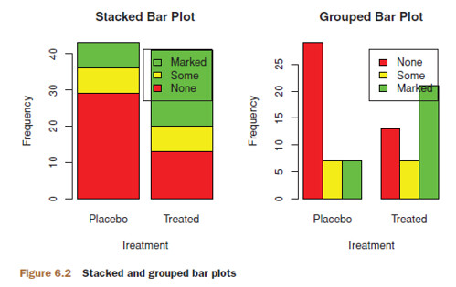
6.1.2 Stacked and Grouped Bar Plots
If input is a matrix rather than a vector, the resulting graph will be a stacked or grouped bar plot.
- If
beside=FALSE(the default), then each column of the matrix produces a bar in the plot, with the values in the column giving the heights of stacked “sub-bars.”- This is stacked bar plot.
- If
beside=TRUE, each column of the matrix represents a group, and the values in each column are juxtaposed ([ˌdʒʌkstəˈpəʊz], 并列, 并排) rather than stacked.- This is grouped bar plot.
library(vcd)
counts <- table(Arthritis$Improved, Arthritis$Treatment)
counts
			Treatment
Improved 	Placebo Treated
	None 	29 		13
	Some 	7 		7
	Marked 	7 		21

barplot(counts,
		main="Stacked Bar Plot",
		xlab="Treatment", ylab="Frequency",
		col=c("red", "yellow","green"),
		legend=rownames(counts)) # stacked bar plot

barplot(counts,
		main="Grouped Bar Plot",
		xlab="Treatment", ylab="Frequency",
		col=c("red", "yellow", "green"),
		legend=rownames(counts), beside=TRUE) # grouped bar plot
6.1.5 Spinograms
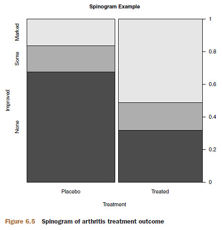
In a spinogram, a stacked bar plot is rescaled so that the height of each bar is 1 and the segment heights represent proportions. Spinograms are created through the spine() function of the vcd package.
library(vcd)
attach(Arthritis)
	counts <- table(Treatment, Improved)
	spine(counts, main="Spinogram Example")
detach(Arthritis)
6.2 Pie Charts
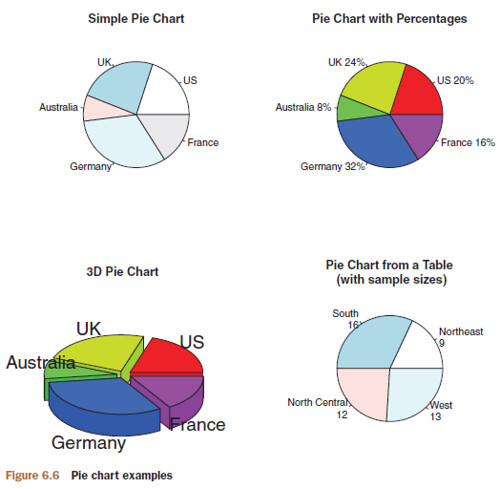
par(mfrow=c(2, 2))

# data for Pie Chart No.1, No.2 & No.3
slices <- c(10, 12, 4, 16, 8)

# Pie Chart No.1
lbls <- c("US", "UK", "Australia", "Germany", "France") # label
pie(slices, labels = lbls, main="Simple Pie Chart")

# Pie Chart No.2
pct <- round(slices/sum(slices)*100) # percentage
lbls2 <- paste(lbls, " ", pct, "%", sep="")
pie(slices, labels=lbls2, col=rainbow(length(lbls2)),
	main="Pie Chart with Percentages")

# Pie Chart No.3
library(plotrix)
pie3D(slices, labels=lbls, explode=0.1,
	  main="3D Pie Chart")

# Pie Chart No.4
mytable <- table(state.region)
lbls3 <- paste(names(mytable), "\n", mytable, sep="")
pie(mytable, labels = lbls3,
	main="Pie Chart from a Table\n (with sample sizes)")
rainbow(length(lbls2))resolves torainbow(5), providing five colors for the graph
Digress: Fan Plot
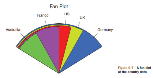
library(plotrix)
slices <- c(10, 12,4, 16, 8)
lbls <- c("US", "UK", "Australia", "Germany", "France")
fan.plot(slices, labels = lbls, main="Fan Plot")
6.3 Histograms
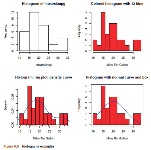
Histograms display the distribution of a continuous variable by dividing up the range of scores into a specified number of bins on the x-axis and displaying the frequency of scores in each bin on the y-axis.
Digress: bar plot 和 histogram 的区别
简单点理解的话,bar plot 画的是一个 row 的数据,把这个 row 上的每个 variable 都画一个 bar;而 histogram 画的是一个 column 的数据,只有一个 variable,而且对这个 variable 的范围 [min, max] 划分了区间,统计各个区间内 observation 的数量。
Histogram 示例
par(mfrow=c(2,2))

# Hist No.1: Simple
hist(mtcars$mpg)

# Hist No.2: With specified bins and color
hist(mtcars$mpg,
	 breaks=12,
	 col="red",
	 xlab="Miles Per Gallon",
	 main="Colored histogram with 12 bins")

# Hist No.3: With rug plot and density curve
hist(mtcars$mpg,
	 freq=FALSE,
	 breaks=12,
	 col="red",
	 xlab="Miles Per Gallon",
	 main="Histogram, rug plot, density curve")
rug(jitter(mtcars$mpg))
lines(density(mtcars$mpg), col="blue", lwd=2)

# Hist No.4: With normal curve and box
x <- mtcars$mpg
h <- hist(x,
		  breaks=12,
		  col="red",
		  xlab="Miles Per Gallon",
		  main="Histogram with normal curve and box")
xfit <- seq(min(x), max(x), length=40)
yfit <- dnorm(xfit, mean=mean(x), sd=sd(x))
yfit <- yfit*diff(h$mids[1:2])*length(x)
lines(xfit, yfit, col="blue", lwd=2)
box()
rug: add a rug plot (x-axis 上的小锯齿)jitter: add a small random value to each data point (a uniform random variate between ±amount)- 这里用
jitter是 in order to avoid overlapping points inrug
- 这里用
density: a kernel density estimatednorm: 计算 $x$ 在这个N(mean, sd^2)分布上的概率密度,即 $f(x)$。参 R Generating Random Numbers and Random Samplingh$mids[1:2]:hist$mids[n]表示第 n 个 cell (bin) 的 midpoint,所以diff(h$mids[1:2])表示的就是一个 cell 的宽度。diff(h$mids[1:2])*length(x)表示的就是所有 hist 柱的面积(cell-width × cell-height)
- 我们为什么要把
yfit乘以这个面积?因为正常情况下 area under f(x) 是 1,与我们 histogram 的比例不符,所以我们乘一个标量使 normal curve 和 histogram 在同一个 scale 上。
6.4 Kernel Density Plots
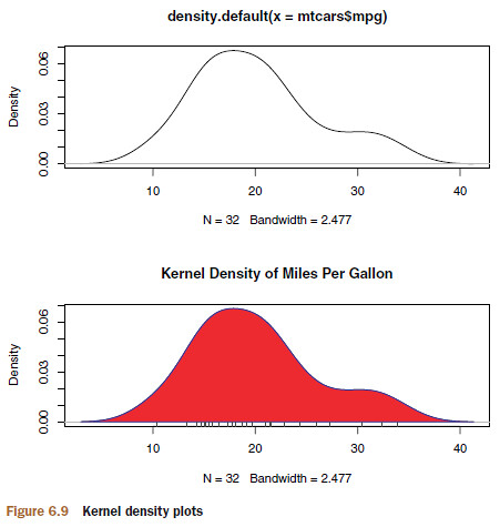
Technically, kernel density estimation is a nonparametric method for estimating the probability density function of a random variable. Although the mathematics are beyond the scope of this text, in general kernel density plots can be an effective way to view the distribution of a continuous variable.
par(mfrow=c(2,1))

# density plot No.1
d <- density(mtcars$mpg)
plot(d)

# density plot No.2
d <- density(mtcars$mpg)
plot(d, main="Kernel Density of Miles Per Gallon")
polygon(d, col="red", border="blue")
rug(mtcars$mpg, col="brown")
The sm.density.compare() function in the sm package allows you to superimpose the kernel density plots of two or more groups. The format is sm.density.compare(x, factor) where x is a numeric vector and factor is a grouping variable.
par(lwd=2)
library(sm)

attach(mtcars)
	cyl.f <- factor(cyl, levels = c(4,6,8), labels =
						c("4 cylinder", "6 cylinder", "8 cylinder"))
	sm.density.compare(mpg, cyl, xlab="Miles Per Gallon")
	title(main="MPG Distribution by Car Cylinders")
	colfill <- c(2:(1+length(levels(cyl.f))))
	legend(locator(1), levels(cyl.f), fill=colfill)
detach(mtcars)
- The
locator(1)option indicates that you’ll place the legend interactively by clicking on the graph where you want the legend to appear.
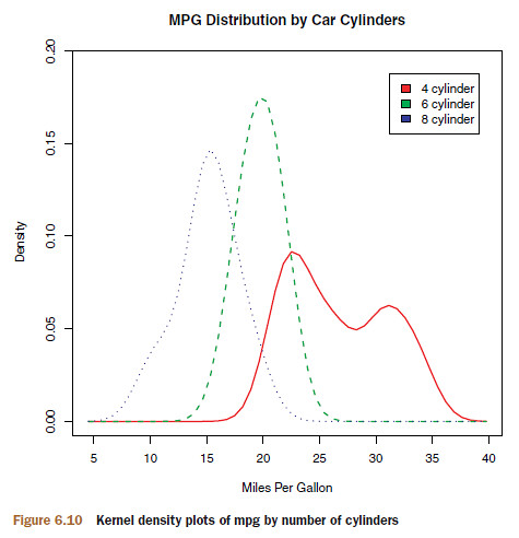
- 这个图的意义就在于体现了 “一般来讲”:一般来说,8 缸比 6 缸费油,6 缸比 4 缸费油,而且 4 缸有一撮是极其省油。
6.5 Box Plots
box plot 的示意可以参考 题外话:boxplot 示意。
6.5.1 Using parallel box plots to compare groups
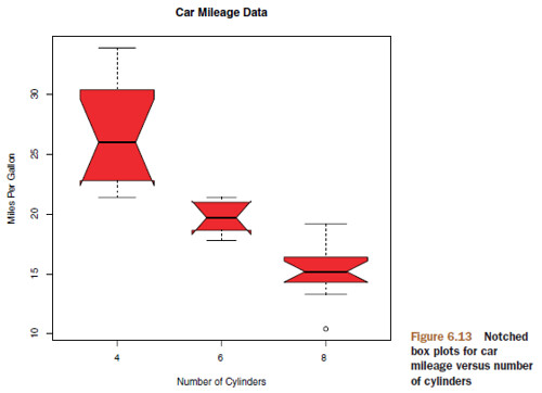
Box plots can be created for variables by group. The format is boxplot(formula, data=dataframe) where
formulais a formula anddataframedenotes the data frame (or list) providing the data.- An example of a formula is
y ~ A, where a separate box plot for numeric variableyis generated for each value of categorical variableA. - The formula
y ~ A*Bwould produce a box plot of numeric variabley, for each combination of levels in categorical variablesAandB.
- An example of a formula is
- Adding the option
varwidth=TRUEwill make the box plot widths proportional to the square root of their sample sizes. - Add
horizontal=TRUEto reverse the axis orientation. - By adding
notch=TRUE, you get notched box plots.- If two boxes’ notches don’t overlap, there’s strong evidence that their medians differ.
boxplot(mpg ~ cyl, data=mtcars,
		notch=TRUE,
		varwidth=TRUE,
		col="red",
		main="Car Mileage Data",
		xlab="Number of Cylinders",
		ylab="Miles Per Gallon")
6.5.2 Violin plots
A violin plot is a combination of a box plot and a kernel density plot.
library(vioplot)

x1 <- mtcars$mpg[mtcars$cyl==4]
x2 <- mtcars$mpg[mtcars$cyl==6]
x3 <- mtcars$mpg[mtcars$cyl==8]
vioplot(x1, x2, x3,
		names=c("4 cyl", "6 cyl", "8 cyl"),
		col="gold")
title("Violin Plots of Miles Per Gallon")
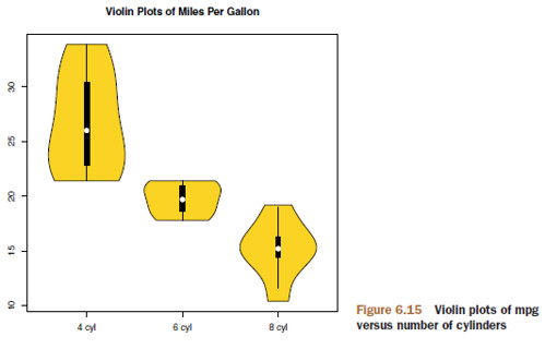
Violin plots are basically kernel density plots superimposed in a mirror image fashion over box plots. Here, the white dot is the median, the black boxes range from the lower to the upper quartile, and the thin black lines represent the whiskers.
6.6 Dot Plots
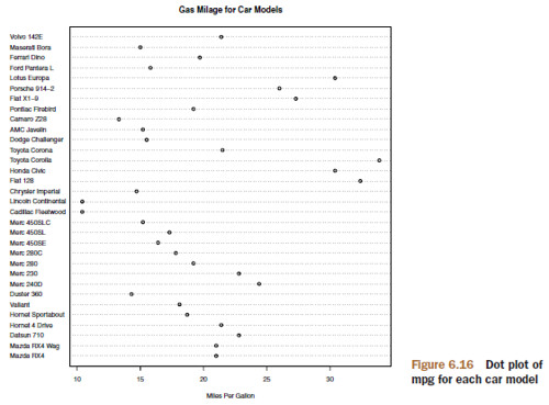
dotchart(mtcars$mpg, labels=row.names(mtcars), cex=.7,
		 main="Gas Mileage for Car Models",
		 xlab="Miles Per Gallon")
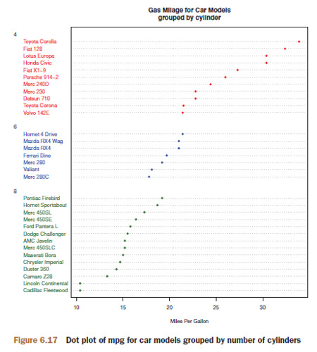
x <- mtcars[order(mtcars$mpg),]
x$cyl <- factor(x$cyl)
x$color[x$cyl==4] <- "red"
x$color[x$cyl==6] <- "blue"
x$color[x$cyl==8] <- "darkgreen"
dotchart(x$mpg,
		 labels = row.names(x),
		 cex=.7,
		 groups = x$cyl,
		 gcolor = "black",
		 color = x$color,
		 pch=19,
		 main = "Gas Mileage for Car Models\ngrouped by cylinder",
		 xlab = "Miles Per Gallon")
7. Basic Statistics
7.1 Descriptive Statistics
常用的 summary 函数
summary()fivenum(): returns Tukey’s five-number summary (minimum, lower-hinge, median, upper-hinge, and maximum).fivenum()只能用于 vector,不能用于 data.framesummary()可以用于 data.frame
Hmisc::describe(): returns the number of variables and observations, the number of missing and unique values, the mean, quantiles, and the five highest and lowest values.pastecs::stat.desc(x, basic=TRUE, desc=TRUE, norm=FALSE, p=0.95)- If
basic=TRUE(the default), the number of values, null values, missing values, minimum, maximum, range, and sum are provided. - If
desc=TRUE(also the default), the median, mean, standard error of the mean, 95 percent confidence interval for the mean, variance, standard deviation, and coefficient of variation are also provided. - Finally, if
norm=TRUE(NOT the default), normal distribution statistics are returned, including skewness and kurtosis (and their statistical significance), and the Shapiro–Wilk test of normality.
- If
psych::describe(): provides the number of nonmissing observations, mean, standard deviation, median, trimmed mean, median absolute deviation, minimum, maximum, range, skew, kurtosis, and standard error of the mean.
计算 Skewness、Kurtosis 并使用 sapply 的一个例子
mystats <- function(x, na.omit=FALSE){
	if (na.omit)
		x <- x[!is.na(x)]

	m <- mean(x)
	n <- length(x)
	s <- sd(x)
	skew <- sum((x-m)^3/s^3)/n
	kurt <- sum((x-m)^4/s^4)/n - 3

	return(c(n=n, mean=m, stdev=s, skew=skew, kurtosis=kurt))
}

# a good practice
vars <- c("mpg", "hp", "wt")
sapply(mtcars[vars], mystats)
			mpg 	hp 		wt
n 			32.000	32.000	32.0000
mean 		20.091	146.688	3.2172
stdev 		6.027	68.563	0.9785
skew 		0.611	0.726	0.4231
kurtosis 	-0.373	-0.136	-0.0227
The distribution of mtcars$mpg is skewed to the right (+0.61) and somewhat flatter than a normal distribution (–0.37). This will be most evident if you graph the data.
常用的分组 summary 函数
aggregate(mtcars[vars], by=list(am=mtcars$am), mean)aggregate最好用mean这样只能返回单个值 (1x1) 的函数- 若是用
fivenum这样返回 1x5 个值的函数,column name 有可能会乱掉
by(mtcars[vars], mtcars$am, summary)- 因为分组后产生的是两个 data.frame,所以这里不能用
fivenum
- 因为分组后产生的是两个 data.frame,所以这里不能用
doBy::summaryBy(mpg+hp+wt~am, data=mtcars, FUN=summary)- 分组后得到的是多个 vector,所以这里可以用
fivenum
- 分组后得到的是多个 vector,所以这里可以用
psych::describe.by(mtcars[vars], mtcars$am)- doesn’t allow you to specify an arbitrary function, so it’s less generally applicable.
- melt-cast 大法
melt-cast 大法示例
library(reshape)

dstats <- function(x)(c(n=length(x), mean=mean(x), sd=sd(x)))
dfm <- melt(mtcars, measure.vars=c("mpg", "hp", "wt"), id.vars=c("am", "cyl"))
cast(dfm, am + cyl + variable ~ ., dstats)
	am	cyl	variable	n	mean 	sd
1 	0 	4 	mpg 		3 	22.90 	1.453
2 	0 	4 	hp 			3 	84.67 	19.655
3 	0 	4 	wt 			3 	2.94 	0.408
4 	0 	6 	mpg 		4 	19.12 	1.632
5 	0 	6 	hp 			4 	115.25 	9.179
6 	0 	6 	wt 			4 	3.39 	0.116
......
7.2 Frequency and contingency tables
7.2.1 Generating frequency tables
- Frequency Table 的数据只有 1 column,它是把所有的情况都列在同一列,然后填上各自的 frequency
- Contingency Table 的数据是 $m \times n$ 的,比如 { male, female }x{ fat, thin, avg }
- 所以 Contingency Table 也叫 cross tabulation or crosstab
- Contingency Table 中,某一 column 或者某一 row 的总计,我们称为 marginal total(因为写在 table 的外侧)
- 所有情况的总计我们称为 grand total
常见的函数有:
table(var1, var2, ..., varN)xtabs(formula, data)prop.table(table, margins): 将原 table 的 frequency 替换成 percentage- 注意这个
margins的值表示 formula 的 variable 的 index。 - 比如 formula 是
~ A + B,那么 A 就是 1^st variable,B 就是 2^nd variable- If you have more than two categorical variables, you’re dealing with multidimensional tables.
- 如果
margins=1则指对 1^st variable 计算 margin;如果margins=c(1,2)则表示两个 variable 的 margin 都算 - “对某个 variable 计算 margin” 的意思是 “对这个 variable 的每个情况都计算 margin”
- 比如 A = { a1, a2 }, B = { b1, b2, b3 } 则
margins=1就是计算 a1 的 margin total 和 a2 的 margin total prop.table这里有点特殊,如果margins=1,则 a1 的百分比之和为 1,a2 的百分比之和为 1- 如果不写的话就是所有 cell 的百分比之和为 1
- 比如 A = { a1, a2 }, B = { b1, b2, b3 } 则
- 下同
- 注意这个
margin.table(table, margins): 计算 margin totalsaddmargins(table, margins): 给原 table 添加 margin total- 这里的
margins又有点不同,如果margins=1则表示 margin total 要与 A 一起排列,形成 { a1, a2, sum } 的局面,所以实际上是对 B 计算 margin - 我可以吐槽么?
- 这里的
ftable(table): makes flat tablegmodels::CrossTable(Arthritis$Treatment, Arthritis$Improved): has options to- report percentages (row, column, cell);
- specify decimal places;
- produce chi-square, Fisher, and McNemar tests of independence;
- report expected and residual values (Pearson, standardized, adjusted standardized);
- include missing values as valid;
- annotate with row and column titles;
- and format as SAS or SPSS style output.
7.2.2 Tests of independence
所谓的 two-way table 其实就是 two-variabled table,但是单个 variable 不一定只有两个值,所以不一定是 2x2 table。
library(vcd)
mytable <- xtabs(~Treatment+Improved, data=Arthritis)

chisq.test(mytable)

		Pearson’s Chi-squared test

data: mytable
X-squared = 13.1, df = 2, p-value = 0.001463
# small p-value indicates that variable A and variable B are not independent.

fisher.test(mytable)

mantelhaen.test(mytable) # Cochran–Mantel–Haenszel test
7.2.3 Measures of association
如果 tests of independence 已经说明了 variable A and variable B are not independent,your interest turns naturally to measures of association in order to gauge the strength of the relationships present.
library(vcd)
mytable <- xtabs(~Treatment+Improved, data=Arthritis)

assocstats(mytable)
					X^2		df	P(> X^2)
Likelihood Ratio	13.530	2	0.0011536
Pearson 			13.055	2	0.0014626

Phi-Coefficient : 0.394
Contingency Coeff.: 0.367
Cramer’s V : 0.394
Likelihood Ratio 参 Conditional Probability。
association 简单理解就是 correlation。”coefficient” 这个词单纯表示 “系数”,不要和 correlation 混了。Phi-Coefficient is similar to the correlation coefficient in its interpretation. 而 “correlation coefficient” 其实就是 correlation 的值,[-1, 1] 之间;上面这三个 coefficient 也是一样的,你当做是不同的 correlation 算法就好了。
- small effect size: $.10 < \lvert \phi \rvert < .30$
- medium effect size: $.30 < \lvert \phi \rvert < .50$
- large effect size: $\lvert \phi \rvert >.50$
7.3 Correlations
cor(x, y = NULL, use="everything", method="pearson")
x: Matrix or data frame.- 如果只写一个
x,那就是 x 各个 variable 之间的 correlation; - 如果写了
y,则是交叉对比 x 和 y。
- 如果只写一个
use: Specifies the handling of missing data. The options areall.obs(assumes no missing data—missing data will produce an error)everything(any correlation involving a case with missing values will be set to missing)complete.obs(listwise deletion)pairwise.complete.obs(pairwise deletion)
method: Specifies the type of correlation. The options arepearsonspearmankendall
states <- state.x77[,1:6]
cor(states)
			Population	Income	Illiteracy	Life Exp	Murder	HS Grad
Population	1.0000		0.208	0.108		-0.068 		0.344 	-0.0985
Income		0.2082		1.000	-0.437		0.340		-0.230	0.6199
Illiteracy	0.1076		-0.437	1.000		-0.588		0.703	-0.6572
Life Exp	-0.0681		0.340	-0.588		1.000		-0.781	0.5822
Murder		0.3436		-0.230	0.703		-0.781		1.000	-0.4880
HS Grad		-0.0985		0.620	-0.657		0.582		-0.488	1.0000

x <- states[,c("Population", "Income", "Illiteracy", "HS Grad")]
y <- states[,c("Life Exp", "Murder")]
cor(x,y)
			Life Exp	Murder
Population	-0.068		0.344
Income		0.340		-0.230
Illiteracy	-0.588		0.703
HS Grad		0.582		-0.488
Testing correlations for significance
Once you’ve generated correlation coefficients, how do you test them for statistical significance? The typical null hypothesis is no relationship (that is, the correlation in the underlying population is 0).
cor.test(x, y, alternative = "two.side", method = "pearson")
x,y: numeric vectors of data values. x and y must have the same length.alternative: specifies a two-tailed or one-tailed testless: Use it when the research hypothesis is that the population correlation is less than 0.greater: Use it when the research hypothesis is that the population correlation is greater than 0.two.side: Assume population correlation isn’t equal to 0.
method: 同cor
cor.test(states[,3], states[,5])

		Pearson’s product-moment correlation

data: states[, 3] and states[, 5]
t = 6.85, df = 48, p-value = 1.258e-08
alternative hypothesis: true correlation is not equal to 0
95 percent confidence interval:
	0.528 0.821
sample estimates:
	cor
	0.703
Unfortunately, you can test only one correlation at a time using cor.test. Luckily, the psych::corr.test() function produces correlations and significance levels for matrices of Pearson, Spearman, or Kendall correlations.
library(psych)

# The use= options can be "pairwise" or "complete" (for pairwise or listwise deletion of missing values, respectively)
corr.test(states, use="pairwise", method="pearson")
7.4 t-tests
For this illustration, we’ll use the UScrime dataset distributed with the MASS package. It contains information on the effect of punishment regimes on crime rates in 47 US states in 1960. The outcome variables of interest will be Prob (the probability of imprisonment), U1 (the unemployment rate for urban males ages 14– 24) and U2 (the unemployment rate for urban males ages 35–39). The categorical variable So (an indicator variable for Southern states) will serve as the grouping variable. The data have been rescaled by the original authors.
7.4.1 Independent t-test
t.test(y ~ x, data) # where y is numeric and x is a dichotomous variable

t.test(y1, y2) # where y1 and y2 are numeric vectors
In the following code, you compare Southern (group 1) and non-Southern (group 0) states on the probability of imprisonment using a two-tailed test without the assumption of equal variances:
library(MASS)
t.test(Prob ~ So, data=UScrime)

		Welch Two Sample t-test

data: Prob by So
t = -3.8954, df = 24.925, p-value = 0.0006506
alternative hypothesis: true difference in means is not equal to 0
95 percent confidence interval:
	-0.03852569 -0.01187439
sample estimates:
mean in group 0		mean in group 1
	0.03851265			0.06371269
7.4.2 Dependent t-test
As a second example, you might ask if unemployment rate for younger males (14–24) is greater than for older males (35–39). In this case, the two groups aren’t independent.
In this case, the format is t.test(y1, y2, paired=TRUE).
library(MASS)

sapply(UScrime[c("U1","U2")], function(x)(c(mean=mean(x),sd=sd(x))))
		U1 		U2
mean	95.5 	33.98
sd 		18.0 	8.45

with(UScrime, t.test(U1, U2, paired=TRUE))

		Paired t-test

data: U1 and U2
t = 32.4066, df = 46, p-value < 2.2e-16
alternative hypothesis: true difference in means is not equal to 0
95 percent confidence interval:
	57.67003 65.30870
sample estimates:
mean of the differences
	61.48936
7.4.3 When there are more than two groups
What do you do if you want to compare more than two groups? If you can assume that the data are independently sampled from normal populations, you can use analysis of variance (ANOVA). ANOVA is a comprehensive methodology that covers many experimental and quasi-experimental designs.
留下评论